
In our code, if the column needs to behave differently, we create a special column type.
Example
We have an icon column which looks different from our other columns.
Within the code, you can search for “icononly” to follow this example.
TS file (Expanding on the code)
In the IColumn, add this new type
export interface IColumn {
  field: string,
  title: string,
  hidden: boolean,
  width: number,
  locked: boolean,
  link?: ILink,
  icon: string,
  icononly: string, //ADDED IN HERE
  multilink: boolean,
  commsLog: number,
  lazy: string,
}
Next you will need to clarify which fields from the dataset, should be this type
(Because both the Config Group Grid and Asset Grid extends the IColumn, both need to now include this)
// Columns that have an icon only, no text
  private configGroupColumnIconOnly: Record<string, string> = {
  };
  private configAssetColumnIconOnly: Record<string, string> = {
    "flagged": "icon-flag",
    "vinMatch": "icon-ok icon-green"
  };
For each grid’s setup, set these values
	this.configGroupsColumns[columnSetting.index - 1] = {
        field: column.field,
        title: column.name,
        hidden: column?.hidden,
        locked: !!this.lockedConfigGroupsColumns[column.field],
        width: columnSetting.currentWidth,
        link: this.linkConfigGroupsColumnSettings[column.field],
        icon: this.configGroupColumnIcon[column.field],
        icononly: this.configGroupColumnIconOnly[column.field], // ADDED here
        multilink: !!this.configGroupColumnMultiLink[column.field],
        commsLog: this.configGroupColumnCommsLog[column.field],
        lazy: this.configGroupColumnLazy[column.field],
    };

	this.assetsColumns[columnSetting.index - 1] = {
        field: column.field,
        title: column.name,
        hidden: column?.hidden,
        locked: !!this.lockedConfigAssetsColumns[column.field],
        width: columnSetting.currentWidth,
        link: this.linkConfigAssetsColumnSettings[column.field],
        icon: this.configAssetColumnIcon[column.field],
        icononly: this.configAssetColumnIconOnly[column.field], // ADDED here
        multilink: !!this.configAssetColumnMultiLink[column.field],
        commsLog: this.configAssetColumnCommsLog[column.field],
        lazy: this.configAssetColumnLazy[column.field],
    };
HTML (Expanded from above image)
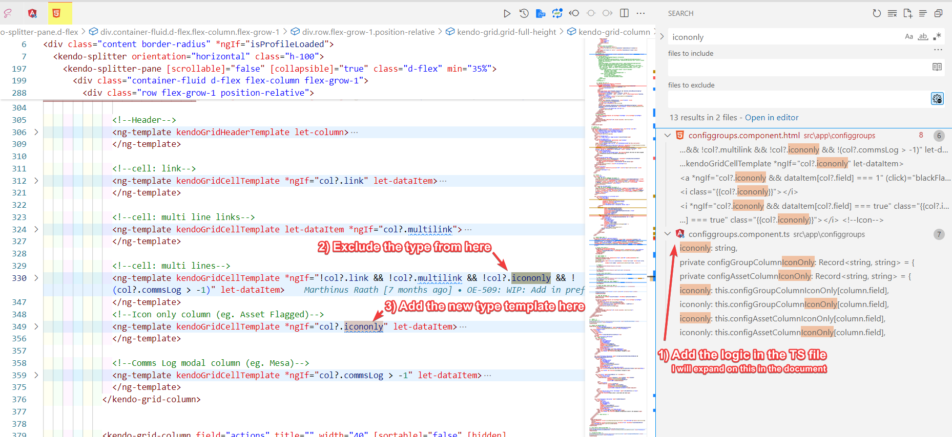
In the image above, number 2 points out to exclude the new column type from the multi lines.
(It is just due to how we created the grid, but we have to do this)
<!--cell: multi lines-->
<ng-template kendoGridCellTemplate *ngIf="!col?.link && !col?.multilink && !col?.icononly && !(col?.commsLog > -1)" let-dataItem>
Next we also have to add in a new template to display this column type, as per point 3 above
<!--Icon only column (eg. Asset Flagged)-->
<ng-template kendoGridCellTemplate *ngIf="col?.icononly" let-dataItem>
<div>
  <a *ngIf="col?.icononly && dataItem[col?.field] === 1" (click)="blackFlagClicked(dataItem)">
	<i class="{{col?.icononly}}"></i>
  </a><!--Icon-->
  <i *ngIf="col?.icononly && dataItem[col?.field] === true" class="{{col?.icononly}}"></i> <!--Icon-->
</div>
</ng-template>
Further idea
If you would like to, for instance, format text, you could do something like this.
Within the ng-template (make sure you have added the let-dataItem)
<div>{{callMethodInTSToFormat(dataItem[col?.field])}}</div>